Create charts to see your business performance
by Intuit•83• Updated 3 weeks ago
Learn how to build charts to see your business performance in QuickBooks Online Advanced and QuickBooks Online Accountant.
 With QuickBooks Online Advanced, you can create your own reports using Custom Report Builder.
Every business tracks unique metrics to measure its performance.
Create custom charts to track what matters most to your business. You choose the metric and the specific data the chart will include, like products, services, and locations. For some charts, you can even compare your numbers to other businesses in your industry.
Here’s how to work with custom charts. Note: You need to be an admin user to use this feature.
Get key performance insights and streamline your business with QuickBooks Online Advanced.
Step 1: See your charts in the Performance center
The Performance center shows all your charts in one place. To see it: Go to Reports ![]() , then Performance center (Take me there).
, then Performance center (Take me there).
When you first visit the performance center, QuickBooks has built-in charts ready for you. You can customize them to meet your needs.
Step 2: Create a new chart
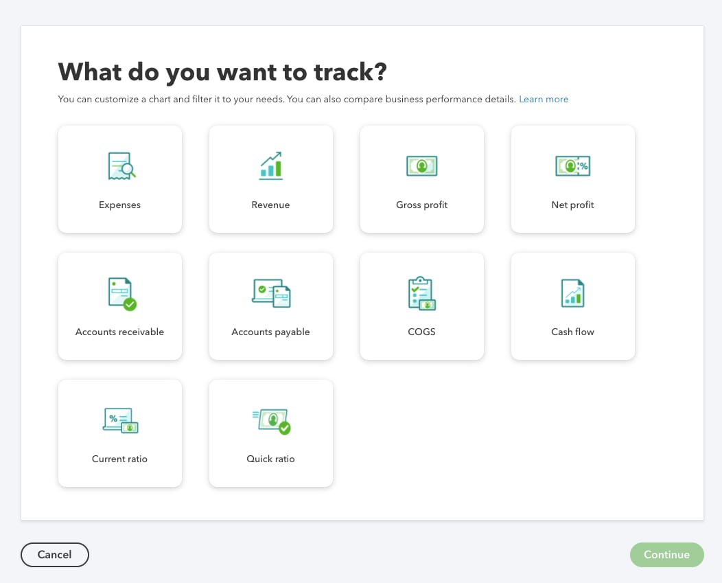
You can track one metric in each chart, and create up to 25 charts. You can make charts to track these metrics:
- Expenses
- Revenue
- Gross profit
- Net profit
- Accounts receivable
- Accounts payable
- COGS (Cost of goods sold)
- Cash flow
- Current ratio
- Quick ratio
Create a quick chart
Want to create a chart for a common metric like revenue or expenses over time? Select Quick add charts and pick a metric from the list. The chart appears instantly on your dashboard.
- To change the time period, select the current time period, then select an option from the dropdown.
- To go deeper into the data, select the vertical ellipsis
 and then Edit widget. You can group the data by categories, apply filters, or compare the results to a previous time period. For more details, see the steps below for creating a chart from scratch.
Create a custom chart from scratch
- Select +Add new chart.
- Select the metric you want this chart to track. Then select Continue.

This opens a customization window. As you make selections, the preview updates to show you exactly what the chart will look like. - Give your chart a name.
- Select the type of chart, such as Trend line, Vertical bar, or Pie chart. These options vary based on the metric.
- In the Time period dropdown, select the time period you want to track.
- In the Group by dropdown, select the category you want to group your data by. You can group by classes, vendors, locations, or other categories. In the Select from multiple dropdown, select the items in the category you want to track. These are what appear in the bars or lines of the chart.
- If you want to see only data from a specific category, select it in the Filter by dropdown. Then use the Select from multiple dropdown to narrow it to items in that category.
Tip: The Group by dropdown determines the type of data the chart will track. The Filter dropdown is where you decide what specific data is included. For instance, you may only want to see data when it applies to specific classes or locations. You can have up to 10 filters. - To compare the results over different time periods, select Compare. Then select Previous period or Previous year same period. For some charts, you can also compare against a budget or goal.
- When you're done, select Add to Dashboard.
When you go back to the performance center, you'll see your new chart.
Create a chart with industry comparisons
You can compare your net profit margin (NPM) and gross profit margin (GPM) to other businesses in your industry. This gives you another way to measure how your business is doing. To create a chart with industry comparisons:
- Select Quick add charts.
- Select NPM vs industry benchmarks or GPM vs industry benchmarks. QuickBooks adds the chart to your dashboard.
QuickBooks pulls the industry data from at least 30 businesses that are the closest match to your industry, revenue range, and location. You can see these details at the top of the performance center.
If you haven’t specified your industry and location yet, or you want to change them:
- Select the gear icon
 above the charts on the top-right.
 - In the Performance center settings, find and select your Industry type from the search bar.
- Select Save.
Note: Industry comparisons don’t appear if QuickBooksdoesn’t have enough data yet for your industry and location. Check again periodically as we gather more data.
An industry comparison chart always shows data from the last 12 months. Currently, this type of chart is not customizable.
Next steps: Edit or delete a chart
Success metrics always need fine-tuning. You can adjust your charts at any time:
- Go to Reports
 , then Performance center (Take me there).
 - Find the chart.
- Select the vertical ellipsis ⋮ on the chart and then Edit chart.
- Make the changes you need. Then select Save.
- To delete the chart, select Delete chart.
More like this
- Customize your reports with a modern viewby QuickBooks
- Run reports by classby QuickBooks
- Create and manage forecastsby QuickBooks
- View key performance indicators for your businessby QuickBooks