Sale Save 50% for 3 months | Power your business with QuickBooks Claim nowBuy now
QuickBooks Blog
Need help choosing a plan?
Created with Sketch. 1800 917 771 Schedule a call
Need help?
We're here for you.
Schedule call
Created with Sketch.
product update

Coming soon: QuickBooks Online will have a new look!

We’re always trying to improve QuickBooks®, whether it’s fixing bugs, adding features or simplifying the product experience. In the coming weeks, you’ll see QuickBooks Online(QBO) and QuickBooks Online Accountant (QBOA) get a brand new look. This update will roll out progressively to all users from early to mid December 2016.

The biggest change is a simplified colour palette with a focus on grey and green, but it’s important to know that this update is about more than just colour. New fonts and sizes make it easy to tell what’s most important. Consistent illustrations bring continuity and meaning to workflows, and reduced distractions on every screen help users stay focused.

These changes make working in QuickBooks easier and create a better, consistent experience across all the QuickBooks products, including QBO, QuickBooks Self-Employed and QBOA.

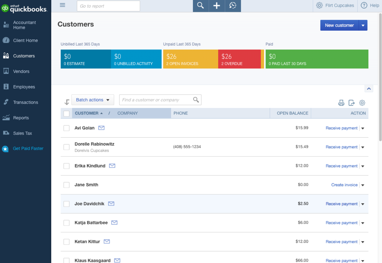
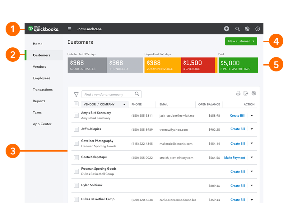
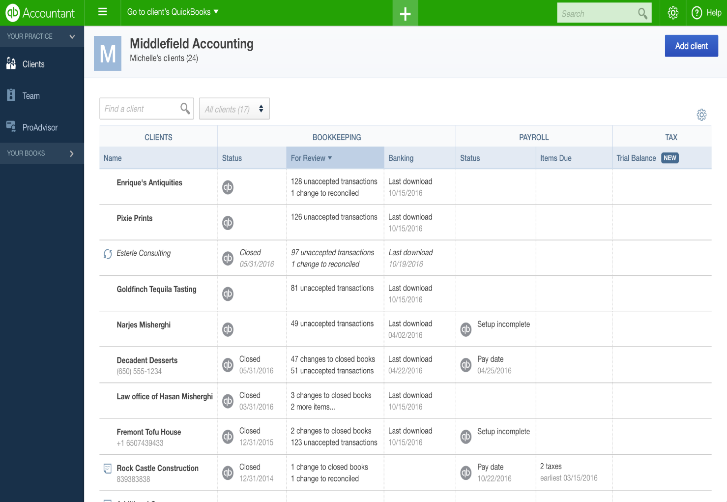
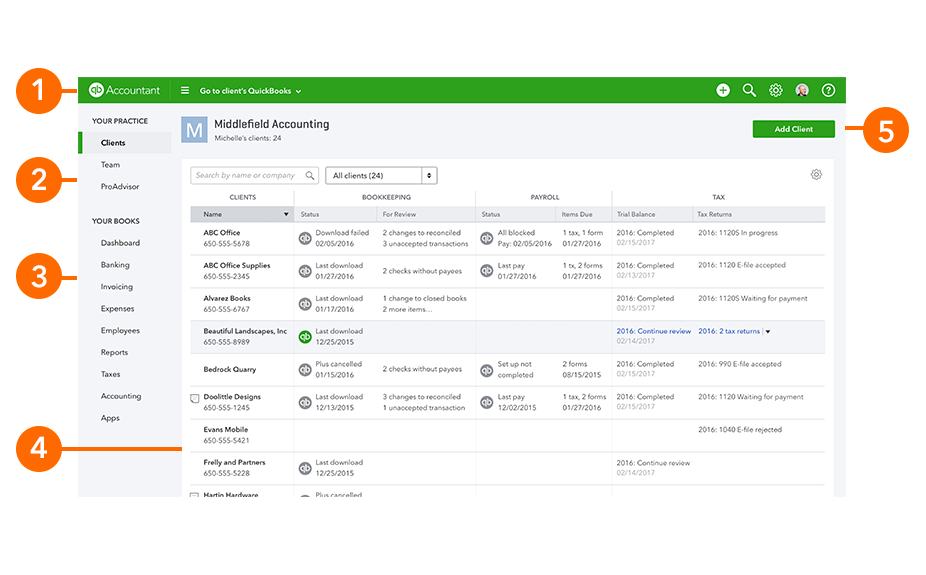
We will be communicating this change to our small business clients too – we just wanted to make sure you knew about it first. To help you visualise the new look, below are a few QBO and QBOA screenshots with explanations of the key design changes (please note the screenshots are from our US products).

We hope you’re as excited about these changes as we are.

‘Customers’ page

Email 1
Email 2
  1. Header: Continuous header bar across the screen with new, unified colour and navigation buttons moved to the right.
  2. Navigation bar: Clean navigation bar with lighter background and no icons. A dark green, vertical indicator highlights your selection.
  3. Lists: Streamlined background (including headers) with brightened action items.
  4. Primary button:New green colour for consistency.
  5. Invoice tracker: Purposeful colours draw the eye to numbers that need attention, while improving visibility of all numbers with a larger font.


New, clean look for QBOA


Email 3
Email 4
  1. Header: The header bar remains green to distinguish your QuickBooks from your clients’.
  2. Navigation bar: Clean navigation bar with lighter background and no icons. A dark green, vertical indicator highlights your selection.
  3. Lists: Streamlined background.
  4. Primary button: New green colour for consistency.

Need more information?

To read more articles related to product updates, visit here.


Related Articles

Looking for something else?

Get QuickBooks

Smart features made for your business. We've got you covered.

Help Me Choose

Use our product selector to find the best accounting plan for you.

QuickBooks Support

Get help with QuickBooks. Find articles, video tutorials, and more.

A computer screen showing a picture of a computer.

TAKE A NO-COMMITMENT TEST DRIVE

Your free 30-day trial awaits

Our customers save an average of 9 hours per week with QuickBooks invoicing*

No credit card needed

Cancel anytime

Unlimited support

By entering your email, you are agree to our Terms and acknowledge our Privacy Statement.