


Your one-stop shop for all the resources you need to start, run, and grow your business with confidence.
- Start your business
- Run your business
- Grow your business
- Accountants and BookkeepersAccountants and Bookkeepers
- Updates
Need help?
We're here for you.
We're here for you.
Schedule call
Browse the QuickBooks Blog


Growing a Business


Running a Business


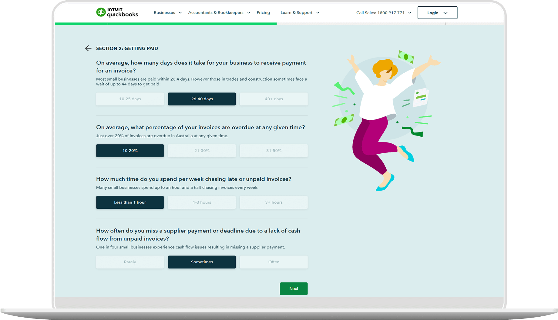
NEW!
FREE Business Health Check
Find out how your business is performing. Complete this short questionnaire to receive a free personalised Business Health Check report!
Looking for something else?
Stay up-to-date with the latest small business insights and trends!
Sign up for our quarterly newsletter and receive educational and interesting content straight to your inbox.
Want more? Visit our tools and templates!