A laptop computer sitting on top of a desk.
Running a business

How to Build a Small Business Website: Design

Now that you know the first steps towards building a website, and online strategy, you can start thinking about the look and feel of your online presence. It is important to create a website that is easy to use, not distracting, and provides relevant information to your customer base. According to Tyton Media, 94% of people cited the design as the reason they mistrusted or rejected a business.

Important factors for a good design include high-quality images of your product, and lifestyle images, as well as an easy to use navigation system. While this may sound easy, there are some important factors to consider when designing your site. Follow these rules to create a professional looking website.


<<Back: How to Move Your Business Online

Next: How to Set Up an Online Store>>

Follow Good Web Design Principles & Use DIY Templates

To save on costs, many small businesses still choose to go the DIY route, even if it might take more of your own time to build. At a minimum, you’ll need to focus on good design best practices, which include:

  • A clean design with lots of whitespace around images and text
  • Captivating web content and copy
  • Easy navigation

Using a platform that offers well-designed, modifiable design templates and themes will ensure you automatically follow many of these principles.

Use an Existing Design Theme:

Here are some options that offer free or premium themes:

SquareSpace

SquareSpace offers award-winning web design templates, which are frequently used by creative professionals in fashion design, food, music, photography, and writing. However, many freelancers also use the site to showcase their other professional services.

You can try out a free website template, but you need to pay for add-on functionality like buying a custom domain, SEO features, mobile optimization, e-commerce tools, website analytics, and more. The platform offers both annual and monthly payment options to fit your budget.

Weebly

Weebly offers easy and customizable drag-and-drop features and is very similar to SquareSpace in its pricing and design template offerings. However, Weebly was created by and is integrated with Square for processing credit card payments. Therefore, it also offers add-ons for e-commerce like dynamic video design elements, site search, and customizable code that you will have to pay for.

Wix

Wix is very similar to Weebly and SquareSpace in its pricing model and design template offerings. It tends to be popular with small businesses seeking to create a brochure site. However, Wix also offers add-ons like e-commerce tools and other business-related functionality like connecting a custom domain and Google Analytics integration.

WordPress

WordPress offers more than 1,400 free website themes that you can customize to your liking. Like SquareSpace, Weebly, and WIX, you have to pay for additional functionality and customization of the theme.

WordPress tends to be the option of choice for freelance writers and publishers who will be creating fresh content on a regular basis, as the platform was originally built for blogging.

Keep in mind; you’ll have to pay for customizable themes and plugins if you want more control over the site versus what you get for free. But they’re often more affordable than hiring a designer to do it for you.

There are tons of affordable “Wordpress for Beginners” courses that can walk you through how to set up an account, how to build pages, and how to create excellent content.

Best Practices for Small Business Websites

Here are some proven elements to help you build a website that boosts your visibility and helps you win more business.

  • Design your website with your users in mind
  • It’s important to demonstrate who you are in your website copy and imagery. More importantly, your users need to see themselves in it.

All of the homework you did when developing your website strategy will come in handy here. Be sure to answer their key questions to answer and address all of their fears, uncertainties, and doubts.

Also, don’t worry about having a super flashy design, which often distracts from your key messages. Having clean, minimalist, and structured page layouts allows users to follow your story, and keeps them on your page.

Then extend the “less is more” aesthetic to make sure there is a logical organization, or hierarchy to the pages on your site so that visitors intuitively know what to click to find what they’re looking for. And there must be an easy trail back to where they began. This can be done by keeping the main navigation bar present at all times.

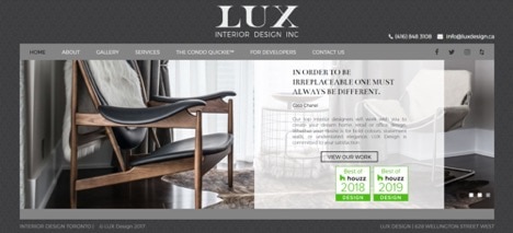
The example below illustrates all of these points. They did a great job by keeping the phone number and email address prominently displayed as well:

Interior design website with phone number and email address static in top navigation bar

Show Some Personality:

Many small businesses have a vague “About Us” page — often full of marketing jargon. Remember that great content is about storytelling, your customers want to know there is a person behind the brand, so it is important to incorporate a human connection into your copy.

That’s why it’s critical to devote appropriate time and thought when developing your “About us” section. Share personal information that readers can relate to, including your setbacks on becoming an entrepreneur, your education, and experience. Make it about you and your team. Explain who you are and share compelling stories about the origins of your business.

For example, Kris Carr shares how her diagnosis of cancer changed her life and led her to create her own successful business. Likewise, Amy Porterfield’s “About” page tells her personal journey, which led her down a bumpy road towards entrepreneurial success.

Adding photos of yourself and your team will help create an emotional connection that builds more trust with customers. Try to keep it real at all costs.

Build Out Your Content

Including a description of your product or services and an introduction to your team is just the baseline of what you need to be successful. It’s vital to include information that helps your customers learn more, whether it’s through FAQs, blog posts, case studies, infographics, testimonials, or video tutorials.

For example, if you sell home staging services and create a page about your experience, be sure to include photos and customer testimonials about your most successful projects.

Then create a video or blog post to share tips on how people can prep their home to sell it. Additionally, you can add a section that discusses the problems people may run into when getting ready to sell their home.

Make sure the content you create helps you appear credible and personable to stand out from your competitors. They should feel like they already know you and will be comfortable dealing with you when they’re ready to get in touch.

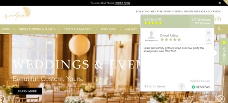
If you’ve spent some time to generate reviews on Google or other reviews sites related to your industry, be sure to display the best ones on your site as well.

Wedding planning website with built-in Google reviews on website design

If you haven’t done so yet, you can start by creating a free business listing on Google, and make generating reviews part of your website marketing process. You can also ask your customers through email or in-person to write a review at the end of a project or purchase cycle.

Inspire Visitors to Take Action

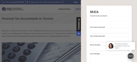
Finally, don’t overlook using a clear call-to-action (CTA) so your visitors know what to do next after visiting your site. It could be downloading a resource, signing up for a free webinar or trial, completing a transaction, or using live chat for more information.

Those CTAs would be written as:

  • “Download our ebook”
  • “Sign up”
  • “Register now”
  • “Try it free”
  • “Buy now”
  • “Open chat”
Accounting Website with Contact Us form and chat pop-up

For best results, don’t just use a web form on your contact page. Include your physical address, phone number, and personal email as well. If you use a contact form, try the process yourself to make sure it works and delivers an email to your inbox. 

<<Back: How to Move Your Business Online

Next: How to Set Up an Online Store>>


Related Articles

Your privacy

We collect data when you use our website to improve its performance. Doing so also helps us provide a secure, personalized experience. Select 'Accept cookies' to agree or 'Cookies settings' to choose which cookies we use. You can change your preferences anytime by clicking the 'Manage cookies' link in the footer.

Choose your cookie preferences

Some cookies are needed to make our website work and can't be turned off. But we need your consent to use others that are not essential. You can make your choices below and update them at any time using the 'Manage Cookies' link. To find out more, visit our Cookies Policy.

These cookies are necessary for the site to function. They also help us keep your data safe.
These cookies allow us to enhance your experience and remember your preferences, region or country, language, and accessibility options.
These cookies tell us how customers use our website. We study and organize this data to help us optimise our content and provide you with personalised experiences.
These cookies help us provide you with relevant communications and ads in our products and on other sites.

Looking for something else?

Get QuickBooks

Smart features made for your business. We've got you covered.

Firm of the Future

Expert advice and resources for today’s accounting professionals.

QuickBooks Support

Get help with QuickBooks. Find articles, video tutorials, and more.