- Start Your BusinessStart Your Business
- Starting a BusinessThe tools and resources you need to get your new business idea off the ground.
- PaymentsEverything you need to start accepting payments for your business.
- Funding & CapitalResources to help you fund your small business.
- Small Business StoriesCelebrating the stories and successes of real small business owners.
- Self-EmployedThe tools and resources you need to run your own business with confidence.
- Run Your BusinessRun Your Business
- Running a BusinessThe tools and resources you need to run your business successfully.
- AccountingAccounting and bookkeeping basics you need to run and grow your business.
- Cash FlowTax and bookkeeping basics you need to run and grow your business.
- PayrollPayroll essentials you need to run your business.
- TaxesTax basics you need to stay compliant and run your business.
- EmployeesEverything you need to know about managing and retaining employees.
- Grow Your BusinessGrow Your Business
- Growing a BusinessThe tools and resources you need to take your business to the next level.
- Sales & MarketingSpread the word: What you need to know about marketing your small business.
- FundingHow to find funding and capital for your new or growing business.
- Midsize BusinessesThe tools and resources you need to manage your mid-sized business.
- Enterprise Suite BlogThe tools and resources you need to grow your own business with confidence.
- E-CommerceHow to start and run a successful e-commerce business.
- TaxesTaxes
- How to fill out a 1099-NEC formLearn how to fill out and file 1099-NEC forms for independent contractors and freelancers.
- How to file small business taxesLearn how to navigate tax season with confidence and minimize your tax liability with this guide.
- Small business 1099: What you need to know for 2025Navigate the complexities of small business 1099 forms and filings with our comprehensive guide.
- 13 documents to give your accountant for small business taxesYour accountant will need these documents to file your small business taxes successfully.
- What's NewWhat's New
- NewsBrowse the latest news, press releases, and reports from QuickBooks.
- AI Resource HubFind the latest on Artificial Intelligence.
- Small Business DataThe latest research and insights for Small Businesses from QuickBooks.
- Small Business StoriesCelebrating the stories and successes of real small business owners.
- Holiday SuccessEverything you need to thrive during your business's busiest seasons.
- AI InnovationsBrowse the latest AI innovations in QuickBooks on the Intuit platform.
- ToolsTools
- All ToolsFree accounting tools and templates to speed up and simplify your workflow.
- AI-Powered Invoice GeneratorTry out this free invoice generator to create an invoice online using Intuit Intelligence.
- Payment Cost CalculatorFind out how much you could save by switching to QuickBooks Payments.
- Paycheck CalculatorAccurately estimate pay for all your employees.







eCommerce companies and direct-to-consumer (DTC) brands have made waves across the retail industry. Some attribute their successes to niche offerings and quirky branding. We should also credit them for developing delightful user experiences (UX).
Improving the user experience on their eCommerce website is a key priority for small fashion business owners. Analyzing site metrics can help identify issues and fine tune navigation.
Reviewing what competitors are doing on their sites can also offer additional insights on what customers are reacting positively to.
UX Lessons from Top 10 eCommerce Fashion Sites
#1 Wanderlust + Co
Homepage:
- Multiple promotions of a current sale
- Relevant sale codes shoppers can apply when checking out
- Testimonials from customers praising products
- Section highlighting fashion media the brand has been featured in
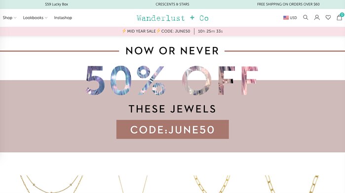
What’s Special: Subscription boxes are all the rage in the retail world. Wanderlust taps into that with their “Lucky Box,” offering a unique collection of items for about half what they would be if bought individually.
#2 Toino Abel
Homepage:
- Instead of product photos it looks more like a professional photographer’s website
- Products are presented in artistic settings, with photos linking to the main eCommerce page
- Description at bottom of page describes the effort and care put into designing and crafting products
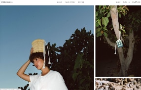
What’s Special: The company describes itself as “a collective of intergenerational artisans.” So the focus is on the brand story, emphasizing the aspects of the business that set it apart from others in the marketplace.
Borrow This: At the very top of the homepage there’s a link for “Press” that takes visitors to a page of positive reviews of the site as well as video clips including products. It’s a great way to show off some of the positive coverage the company has received.
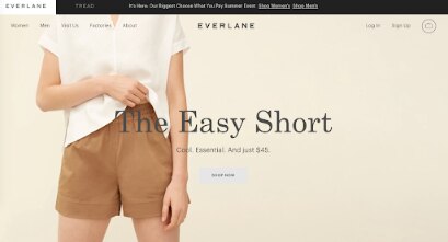
#3 Everlane
Homepage:
- Minimalist design approach, with one large promotion block at the top of the page
- Just a few photos linking to general product categories
- Link at the top to the Tread secondary brand offering environmentally-responsible shoes
What’s Special: By calling out the company’s factories it emphasizes its commitment to the environment, workers and other causes. Highlighting the products made in each location deepens the connection between the shopper and the brand by offering an opportunity to learn more.
Borrow This: Instead of a traditional “shopping cart,” visitors add items they’re interested in to their “bag” on the site. It’s a small difference that creates something unique about the store, especially since it’s represented by an actual bag icon.
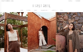
#4 First Rite
Homepage:
- All the product photos feature the same model wearing different items, helping visitors imagine how the clothes would look on themselves
- The photos at the top don’t link anywhere and are just for display, not sales
- Other photos on the front page link to product collections and promotions
What’s Special: There are two content sections on the site: “Travel Journal” with photos from lookbook shoots and “Friends of First Rite: highlighting someone who shares the brand’s love of travel and fashion. These extend the visual style of the site and reinforce its values and style.
Borrow This: The Lookbook on the front page isn’t linked to another part of the site but is just a clickable carousel of images. That allows visitors to just check out various products in one sitting, without the experience being interrupted by clicking through to individual pages.
#5 Hackwith Design House
Homepage:
- Statements of the company’s mission and values are mixed in with product photos, focused on creating sustainable fashion
- Product runs are referred to as “limited” to create a sense of exclusivity
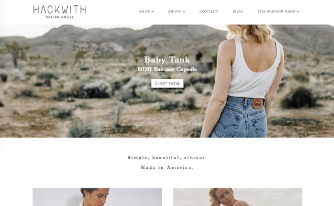
What’s Special: Hackwith has a stand-alone section of the site called “The Sustain Shop” where customers can return items that don’t fit, have developed signs of wear or are no longer wanted. Those returned items earn the customer a $20 credit toward their next purchase, part of the company’s commitment to sustainability. .
Borrow This: There’s a minimalist, monochromatic look applied to the photos on the front page. They all feature models wearing simple, white pieces, with all the photos combining to add a good amount of white space to the simple page design.
#6 Asos
Homepage:
- Only element on the page is a single, large, colorful photo introducing the brand
- Visitors have a single choice to continue shopping: Women or Men
- Primary photo shows a group of people hanging out, communicating a lifestyle instead of promoting a single product
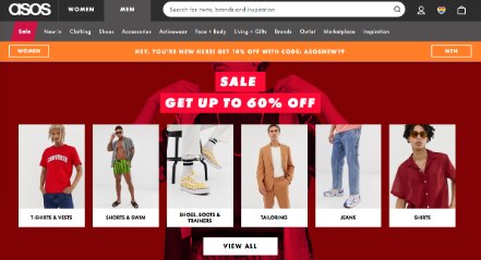
What’s Special: Asos both sells its own branded fashion items and operates a Marketplace where visitors can shop for items from 750 smaller brands and boutique retailers. By acting as a showcase for other retailers, Asos gives those smaller brands a valuable showcase where they can be found by some looking for just the right items.
Borrow This: The front page of the site features at least three different prompts to choose between the Men’s and Women’s shops. Each one has its own tracking code attached to the link, so those analyzing site behavior and metrics can see which links are getting people’s attention and leading to higher conversion rates.
#7 Uniqlo
Homepage:
- Shows a “more is more” approach, with a large collection of products and detailed descriptions for each one
- Front page scrolls down a long way, highlighting as many products as possible
The use of Japanese characters along with English names and descriptions communicate the company’s roots
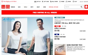
What’s Special: Each product page does feature reviews and ratings from previous customers, but the site also highlights the celebrity Ambassadors who endorse Uniqlo’s clothing. That’s a very different message being sent to visitors, one that relies on people being interested in recommendations from well known individuals in addition to peers.
Borrow This: Each items highlighted on the front page features a category or other label that serves as an appeal and call to action for the visitor. Some are “Limited-Time Offer,” others are “New Arrivals” or “Uniqlo Favorites” to catch shopper’s eyes and encourage clicking through.
#8 Zaful
Homepage:
- Appeal to younger audience is clear through the use of bright colors, youthful models and flashy visuals
- Multiple elements focus on payments, specifically PayPal as a preferred method
- Information at the bottom of the page on how to get a “Student Discount” on purchases
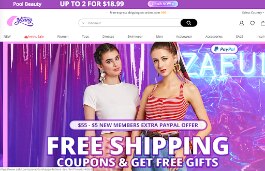
What’s Special: Featured on the front page is a game visitors can play to win coupons good for future purchases. By creating something interactive, There’s an element of promotion baked in, with players able to get more chances to play by sharing the game on their social networks.
Borrow This: When viewing one of the product categories listed at the top of the page, certain sections are displayed in red. Those are sections Zaful specifically wants to draw people’s attention to.
#9 Zara
Homepage:
- Big, bold images are similar to what you might find on the cover of a print catalog
- Menu on the left of the page is available for visitors to dive in further
- Lack of other photos offers an uncluttered experience
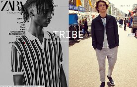
What’s Special: The site’s “New In” section helps highlight the latest additions to the store in a clear and concise manner. It rewards return shoppers by offering them something new since their last visit, breaking updated items into categories consistent with the rest of the site.
Borrow This: “Search” is consistent at the top of the page throughout the site, remaining in the same spot no matter which section you’re in. As soon as you start typing it shows a list of potential terms, all of which you can click on and find what you’re looking for.
#10 Urban Planet
Homepage:
- Content is broken up into nicely defined sections, each with its own call to action and large photos
- Bottom of the page features a stream of “#UrbanPlanet” updates showing off photos published to social media
- Many of those photos are reposts from customers, showing off products in the real world and encouraging people to share their own
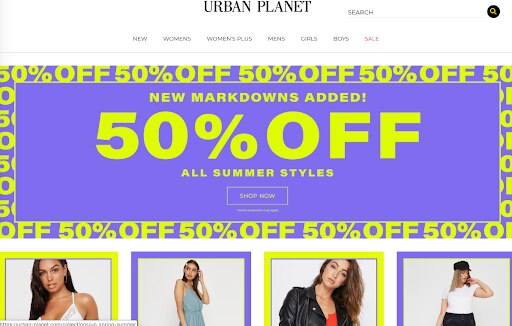
What’s Special: As you highlight one of the sections at the top of the page a new menu appears below it. That’s instead of how sites usually work, where a drop-down menu is shown.
Borrow This: The site is built using a responsive design, meaning the layout of the elements changes depending on the size of your browser window. That makes it especially friendly for visiting on mobile devices, an important factor when considering how much shopping is done via mobile.
UX Tips For Your Business
While most all of these sites offers something unique, there are also a few consistent tactics used that can be applied to your own eCommerce business:
- Email newsletter signup prompts, either as soon as the site loads or in another prominent section of the homepage
- Social sharing, encouraging visitors to post the products they’re looking at on their own social network profiles
- Discounts and sales, especially for shoppers placing their first order on the site
Some of these lessons are one you may already be applying. Some you may have evaluated previously and put aside. Others may be new to you require research to see how they might be applied.
Whatever the case, it’s worth taking a moment to see what others are doing - and doing well - to see if those tactics can grow your eCommerce business.
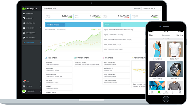
TradeGecko is a powerful platform for managing your commerce business.
Give your business the upper-hand and start a free trial today

Explore what you can do with QuickBooks
Explore what you can do with QuickBooks

See profit at a glance


Get expert help
Looking for something else?
Firm of the Future
Topical articles and news from top pros and Intuit product experts.
QuickBooks Support
Get help with QuickBooks. Find articles, video tutorials, and more.
Call Sales: 1-800-285-4854





© 2026 Intuit Inc. All rights reserved.
Intuit, QuickBooks, QB, TurboTax, Credit Karma, and Mailchimp are registered trademarks of Intuit Inc.
Money movement services are provided by Intuit Payments Inc., licensed as a Money Transmitter by the New York State Department of Financial Services. For details about our money transmission licenses, or for Texas customers with complaints about our service, please click here.
By accessing and using this page you agree to the Website Terms of Service.