


Google’s mistake is your gain. Google accidentally published a 108-page Playbook filled with best practices for retail and eCommerce UX design, and subtitled “Ecommerce playbook. Creating frictionless experience across the funnel.”
While it is marked “proprietary + confidential,” the PDF is indexed by the search engine giant and is freely available to access online. Since there’s no claim or clarity about its provenance, we describe it as a Secret document in this blog.
But first…
What is a Playbook?
A playbook is a book containing strategies typically used by sports teams or a play-by-play guide to help companies define their workflows, standard operating procedures and cultural values. This secret eBook certainly fits the bill as it’s filled with real-life examples and pointed advice on how to improve conversions and sales.
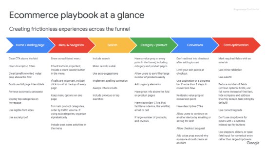
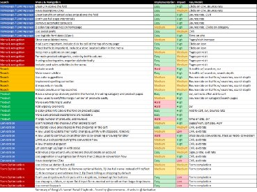
We combed through advice pulled directly from Google’s highest-profile retail clients and narrowed it down to 6 areas for improvement, which are most helpful for eCommerce merchants:
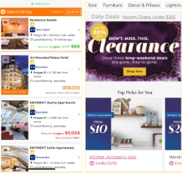
1. Home/Landing Page
2. Menu & Navigation
3. Search
4. Category/Product
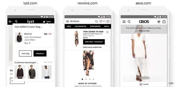
5. Conversion
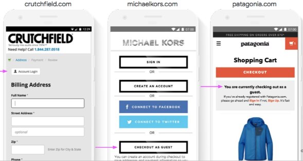
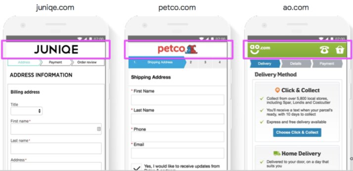
6. Form Optimization
These 6 areas were further broken down into 43 key activities. At a glance, these seem overwhelming.
So we plucked the top 5 things you can implement in your website today.